1). Summarize and describe the distribution of a categorical variable in context. …
1). Summarize and describe the distribution of a categorical variable in context. 2). Generate and interpret several different graphical displays of the distribution of a quantitative variable (histogram, stemplot, boxplot). 3). Summarize and describe the distribution of a quantitative variable in context: a) describe the overall pattern, b) describe striking deviations from the pattern. 4). Relate measures of center and spread to the shape of the distribution, and choose the appropriate measures in different contexts. 5). Compare and contrast distributions (of quantitative data) from two or more groups, and produce a brief summary, interpreting your findings in context. 5). Apply the standard deviation rule to the special case of distributions having the "normal" shape.
Introductory statistics course developed through the Ohio Department of Higher Education OER …
Introductory statistics course developed through the Ohio Department of Higher Education OER Innovation Grant. The course is part of the Ohio Transfer Module and is also named TMM010. For more information about credit transfer between Ohio colleges and universities please visit: www.ohiohighered.org/transfer.Team LeadKameswarrao Casukhela Ohio State University – LimaContent ContributorsEmily Dennett Central Ohio Technical CollegeSara Rollo North Central State CollegeNicholas Shay Central Ohio Technical CollegeChan Siriphokha Clark State Community CollegeLibrarianJoy Gao Ohio Wesleyan UniversityReview TeamAlice Taylor University of Rio GrandeJim Cottrill Ohio Dominican University
A data set is a listing of variables and their observed values …
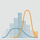
A data set is a listing of variables and their observed values on individuals or objects of study. In this topic we will learn about how to organize data on a single variable using frequency distributions which form the basis for constructing charts including Pie Charts, Bar Charts and Histograms. We also explore Stemplot. It is important to note that the type of chart to be used depends on the type of data/variable to be represented.Given a data set be able to construct a frequency table, find and interpret relative frequency of a value, find and interpret cumulative frequency.For categorical data make and interpret a Pie chart and a Bar Chart. Further know when to construct each type of chart, their relative advantages and limitations.For quantitative data be able to make and interpret Stemplot, Histogram, Frequency Polygon, Ogive, Time Series Graph. Further know when to construct each type of chart, their relative advantages and limitations. Textbook Material - Chapter 1 – Sampling and Data – pages 13 – 19Chapter 2 – Descriptive Statistics – Pages 67 – 88
No restrictions on your remixing, redistributing, or making derivative works. Give credit to the author, as required.
Your remixing, redistributing, or making derivatives works comes with some restrictions, including how it is shared.
Your redistributing comes with some restrictions. Do not remix or make derivative works.
Most restrictive license type. Prohibits most uses, sharing, and any changes.
Copyrighted materials, available under Fair Use and the TEACH Act for US-based educators, or other custom arrangements. Go to the resource provider to see their individual restrictions.